Form
Introduction
Creating forms in Digisquares is a flexible and user-friendly process that empowers you to design custom forms with precision. Whether you're building a simple contact form or a complex data collection tool, Digisquares offers a wide range of customization options to suit your needs.
Form Creation in Digisquares
Overview
Creating forms in Digisquares is a straightforward process that offers a high degree of customization. You can design forms with unique names, icons, and layouts, while tailoring the header, footer, themes, styles, and adding various containers and fields with validation options.
Step 1: Access the Form Builder
- Open the Digisquares platform.
- Navigate to the Form section from the left-hand menu.
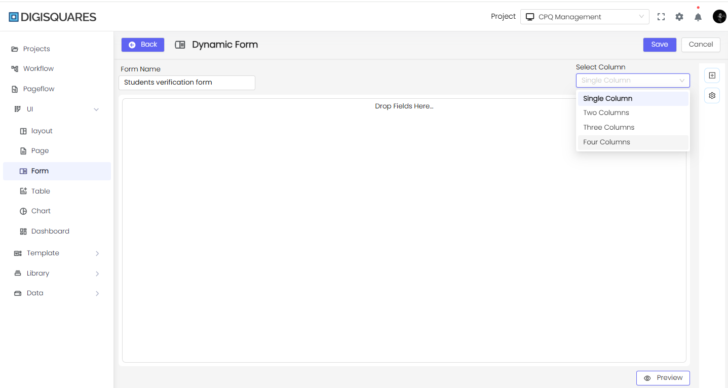
- Click on the New Form button to create a new form.
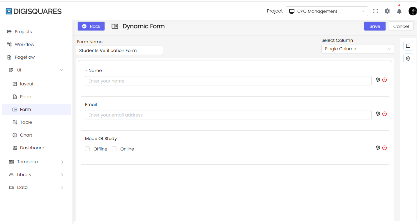
- Enter a Form Name in the input field.
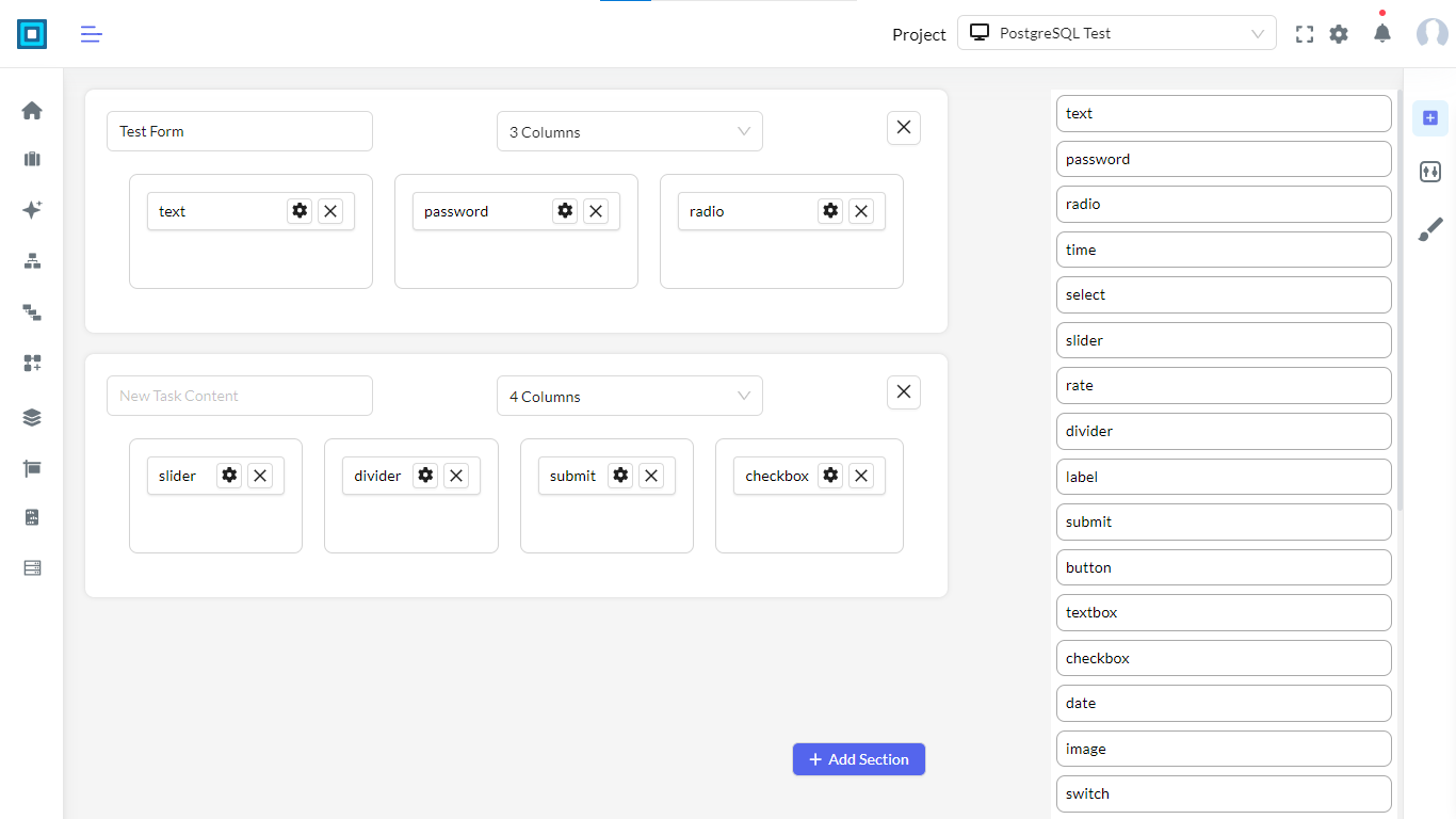
- Select the Column Layout:
- Single Column – Best for simple forms.
- Two Columns – Balanced layout.
- Three Columns – Compact structure.
- Four Columns – Best for detailed forms.
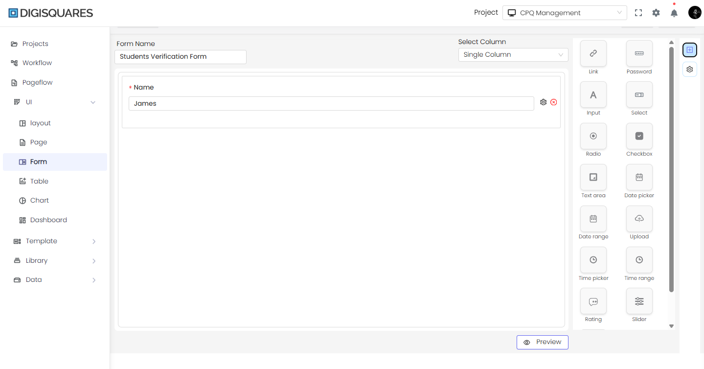
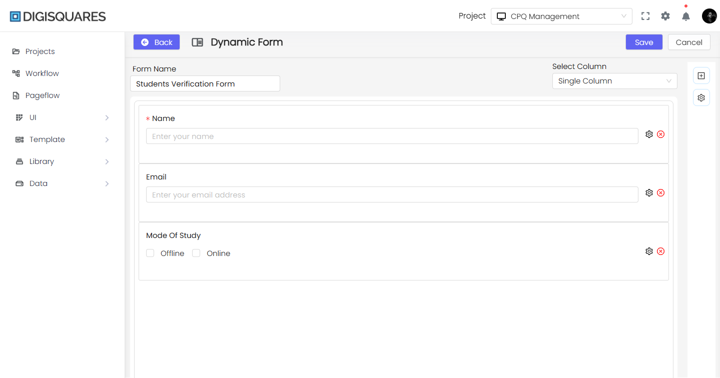
Step 2: Adding Form Fields
- Locate the Field Selection Panel on the right side.
- Drag and drop the required fields into the form canvas.
Field Categories & Use Cases:
-
Basic Input Fields (For user text entries)
Field Name Purpose Example Use Case Text Input Single-line input Name, Email, Phone Number Text Area Multi-line input Address, Description Password Field Secure input field Login & Signup Forms Number Input Only allows numeric values Age, Quantity, Price -
Date & Time Fields (For selecting date & time)
Field Name Purpose Example Use Case Date Picker Select a single date Birthdate, Booking Date Time Picker Select a specific time Appointment, Meeting Time Date Range Picker Select a start & end date Leave Request, Event Duration Time Range Picker Select a time range Work Shift Hours, Availability -
Selection Fields (For predefined options)
Field Name Purpose Example Use Case Dropdown Select Choose one option from a list Country, Payment Method Multi-Select Dropdown Choose multiple options Skills, Interests Radio Buttons Select one option from a group Gender, Subscription Plan Checkboxes Select multiple options Preferences, Interests -
File & Media Upload Fields (For uploading documents)
Field Name Purpose Example Use Case File Upload Upload any document/file Resume, Proof of Identity Image Upload Upload images Profile Picture, Product Image Signature Pad Capture a digital signature Agreements, E-Signatures -
Interactive & Toggle Fields (For user choices)
Field Name Purpose Example Use Case Switch Toggle Enable/disable an option Notifications, Dark Mode Slider Select a value in a range Rating, Budget Estimation Rating Provide a rating (stars/numbers) Feedback, Product Reviews -
Container & Group Fields (For complex forms)
Field Name Purpose Example Use Case Repeating Sections Allow adding multiple entries Work Experience, References Group Fields Combine related fields Address Block (Street, City, Zip) Tabs Section Organize fields under different tabs Multi-step Forms, Profiles
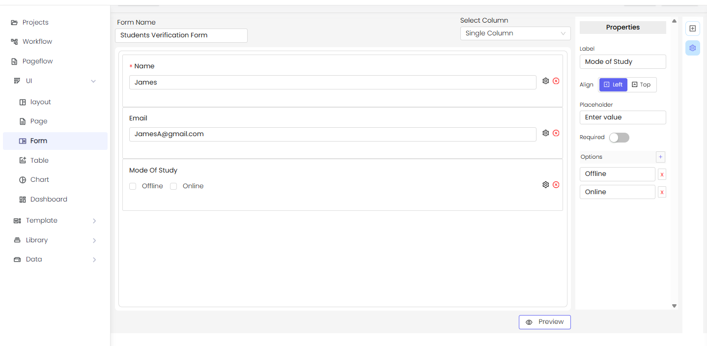
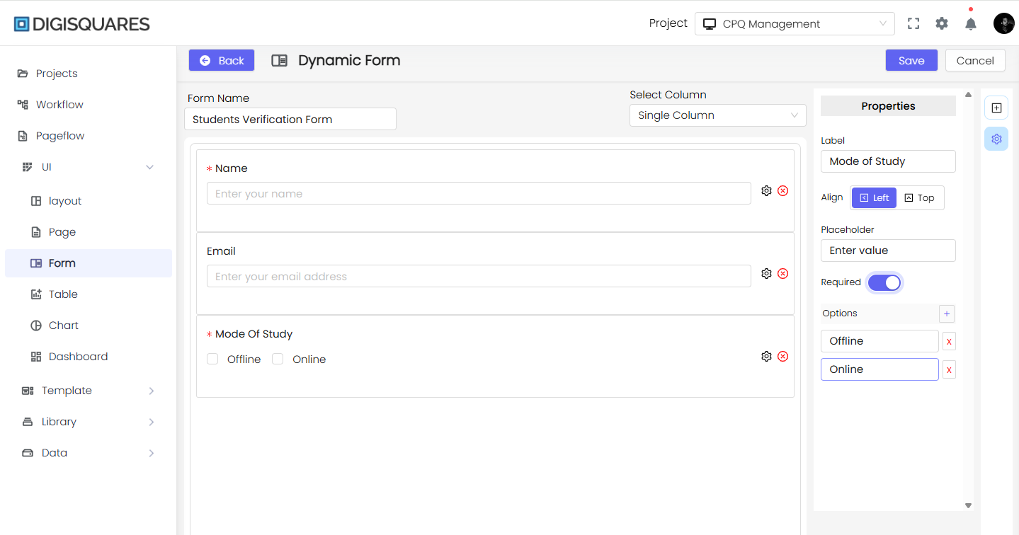
Step 3: Customizing Fields
- Click on any field to open the Properties Panel.
- Customize the following:
- Label – Set the field title.
- Placeholder – Instructional text inside the field.
- Validation Rules – Required fields, character limits, pattern matching.
- Alignment – Set position (Left, Right, or Top).
- Options for Dropdown, Checkboxes, and Radio Buttons – Add dynamic choices.
Example: Configuring a Gender Field
- Label: Gender
- Placeholder: Select your gender
- Options: Male, Female, Other
- Required: Enabled
Example: Configuring a Date Range Picker
- Label: Select Date Range
- Placeholder: Choose start and end date
- Required: Yes
- Format: YYYY-MM-DD
- Min & Max Date Range: Customizable
Step 4: Adjusting Form Layout
- Choose the number of columns:
- Single Column – Full-width fields.
- Two Columns – Balanced layout.
- Three Columns – Compact form.
- Four Columns – Best for detailed forms.
- Drag and rearrange fields as needed.
Step 5: Preview & Save Form
- Click Preview to see how the form looks.
- Make necessary adjustments.
- Click Save to store your form.
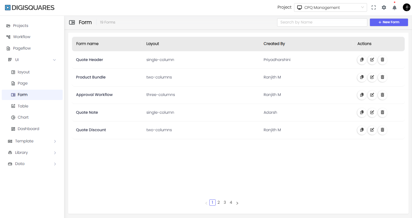
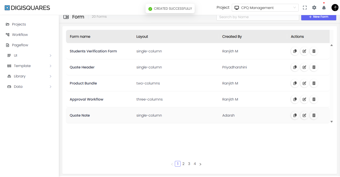
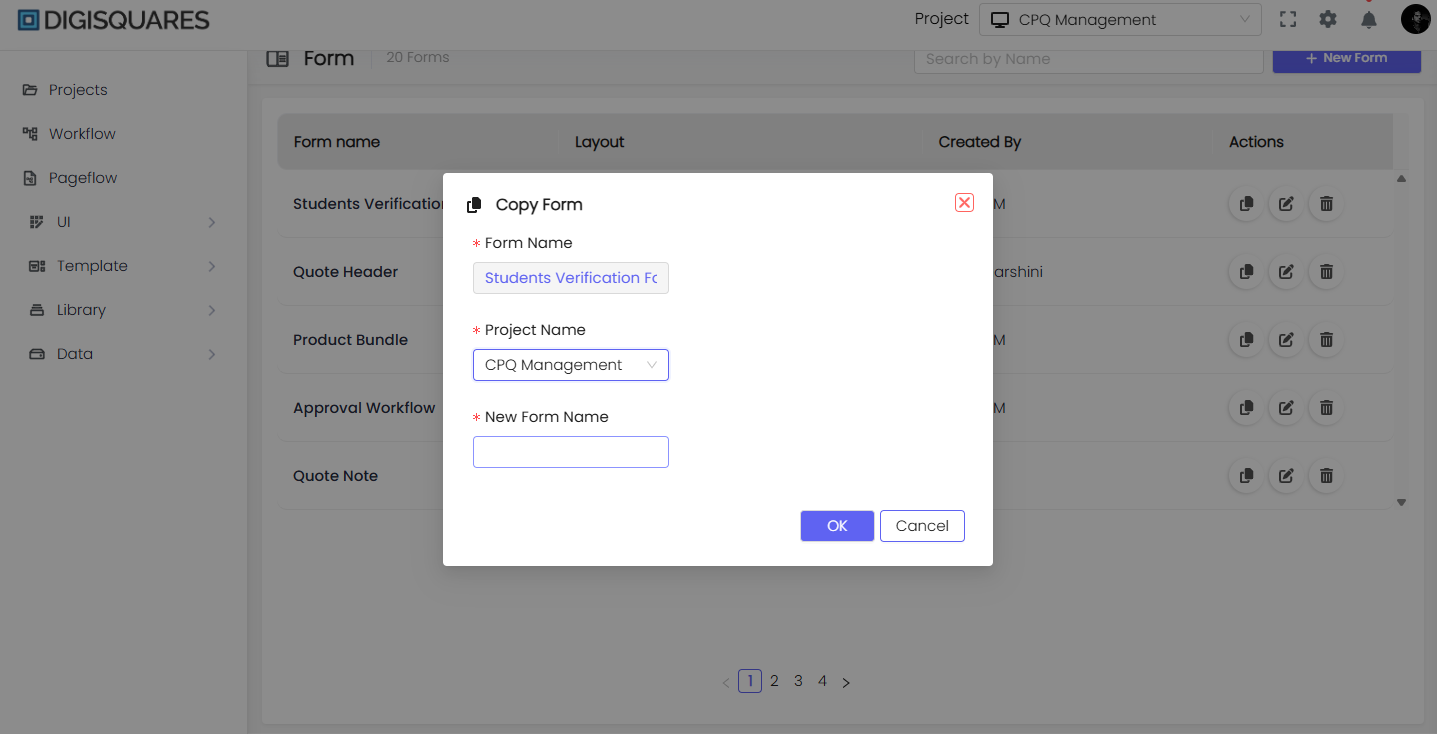
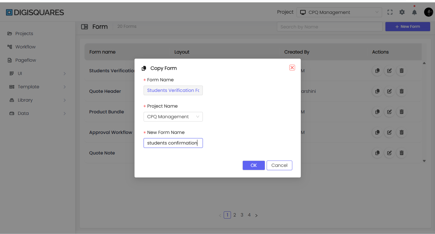
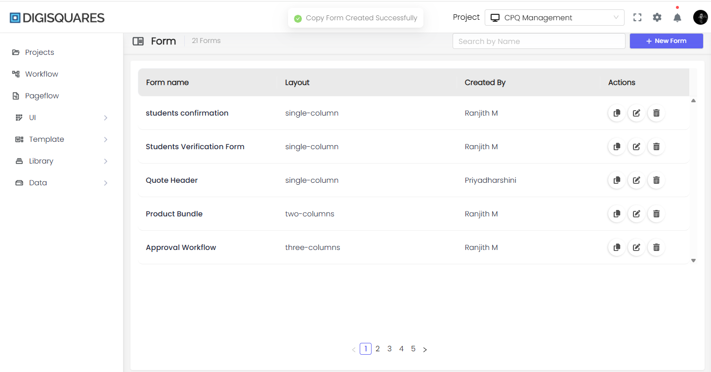
Step 6: Managing Forms
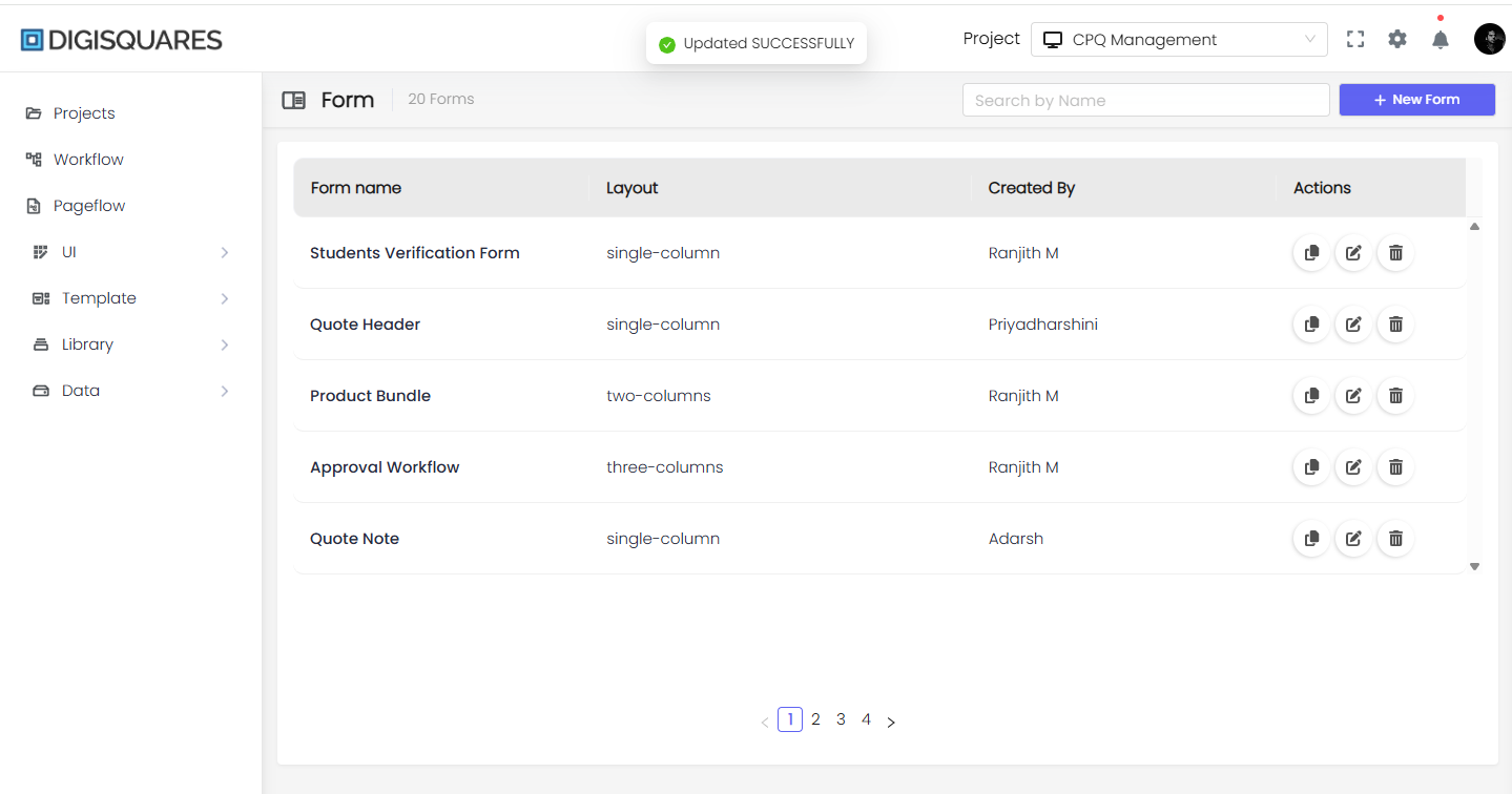
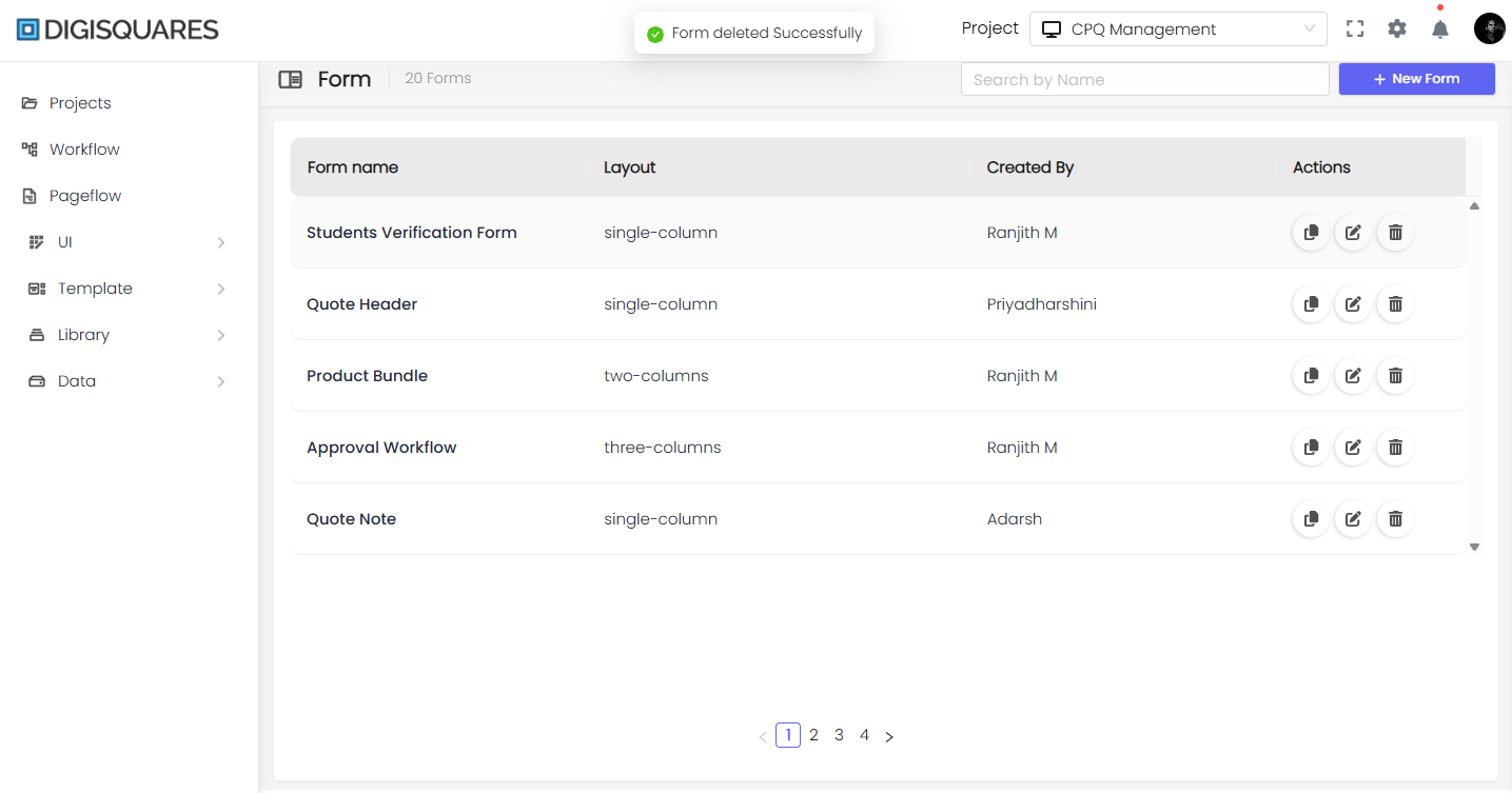
- Navigate to the Forms Dashboard.
- View saved forms with details:
- Form Name
- Layout Type (Single, Two, Three, or Four Columns)
- Created By
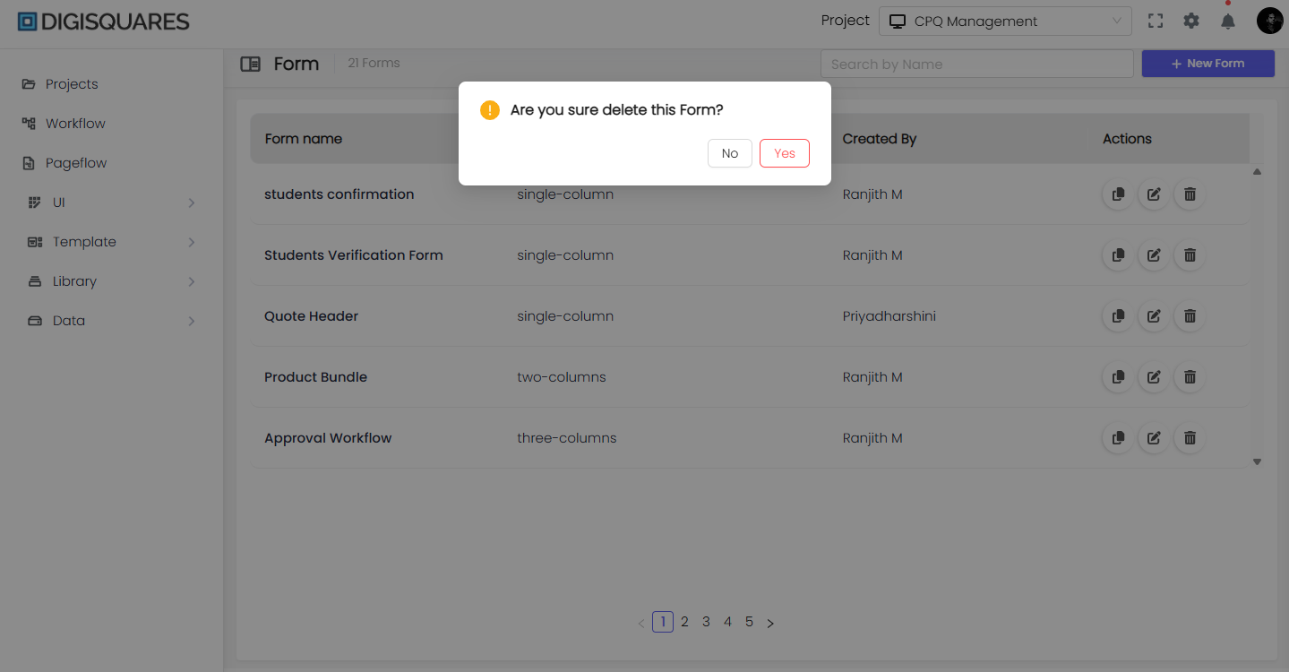
- Available Actions:
- Edit
- Duplicate
- Delete
Step 7: Using the Form
- The saved form is now ready for use in different projects.
- Users can submit the form with:
- Validations
- Dynamic Field Handling
- Conditional Logic – Show/hide fields based on user input.
- Repeating Sections – Allow users to add multiple entries.
- API Integrations – Connect with external databases.
Form Validation
-
Validation Rules
- Define validation rules for each field to ensure data accuracy and completeness.
- Set error messages for failed validation.
-
Error Handling
- Customize how validation errors are presented to users, such as inline messages or pop-up notifications.


Conclusion
The Digisquares Form Builder makes it easy to create and customize forms without coding.
- Drag-and-Drop Design
- Advanced Field Settings
- Multi-Column Layouts
- Validation, Styling, and Theming
- Live Preview & Editing
Start designing your custom forms today with Digisquares!